The Do's and Don'ts of letter-spacing
Another week, another article about something design related! If you missed the past few, I strongly suggest checking them out, as these little things can make a big impact on your overall design. And, have you noticed that they’re all typography related?
People don’t give typography enough credit! I’ll save the rest of that rant for another day though. For the time being, let’s look into what you should, and shouldn’t, use letter-spacing for on the web.
Why letter-spacing matters
Before I get into some tips and tricks though, I want to just do a quick mention on why you should care about letter-spacing to begin with.
- It affects readablity (helps it if done right, hurts it if done wrong)
- Can help give your type a more refined look
Readability should come before anything else. We have text on our pages, so any decisions we’re making with letter-spacing should be about making our text as easy to read as possible.
That has the added benefit of making things just look nicer while you’re at it. Adding in the little details to your designs is what takes something from just okay to looking really sharp, and nice uses of letter-spacing can really help with that.
letter-spacing do’s and don’ts
DO: Add** letter-spacing to uppercase text
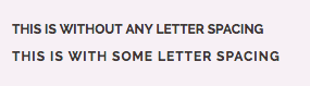
If your text is all uppercase, it’s harder to read (the first thing here is, you shouldn’t put a lot of text in all caps, but if it’s short titles, you can get away with it).
One way to help make it easier to read is to add a bit of letter-spacing. Aim for just a touch, just to space things out a little bit.
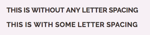
You’ll notice in the above example that it’s barely noticable. That’s sort of the point! We aren’t doing it for creative reasons, or trying to make an impact, we’re just making a subtle change. It gives each character just a little bit more room, and helps boost readability a touch.
DON’T: Add too much letter-spacing
While adding just a touch can make uppercase text easier to read, adding too much makes it harder to read, so watch out for that. Most of the time, the goal is to make text easier to read, so always keep that in mind when playing around with your values.
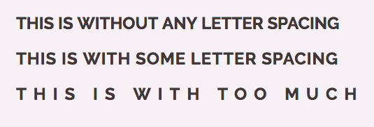
Maybe you like how the above example looks with the massive letter-spacing. It definitely gives it a unique look. You might have seen some really nice uses of really big letter-spacing out and about in the world as well, but most of the time it’s in very specific situations. It gives it a unique look, but it also makes it a lot harder to read!
So yes, it might be used in a creative way to look nice, or to purposefully slow the reader down, but be very aware that it can very much impact the readability of the text, so try not to go too crazy. Use it in a logo for the slogan or something, don’t use it on a run of words that you actually want people to read.
DO: Increase** letter-spacing for small text
When text drops to smaller sizes (under 16px on the web, in general), it gets harder to read. Depending on the font, a small amount of letter-spacing can help. Again, don’t push it too far though! At smaller font sizes, it’s possible the characters appear a little crowded though, and this can help make things a touch easier to read.
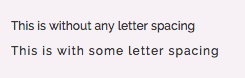
This could be for things like captions on images, bylines, and other places where a smaller font-size makes sense. Just add a little touch though, don’t go nuts!
DON’T: Play with the letter-spacing of your body text
If the font you picked for you body looks a little too cramped and you feel that adding a little bit of letter-spacing would help make it more readable, my guess is you’ve picked a display font for your body.
Fonts are designed for specific purposes (good fonts at least), and have been optimized to be used at specific sizes. If you look at fonts designed for the print world, some super families go beyond the whole light, medium, bold, black, scale. They’ll have those (and many more) for captions, and then a new set for body, and another set for display. Captions are for small sizes, body for body text, and display for bigger sizes like our headings. Head on over to Adobe Fonts (formally Typekit) and in your search options, you can pick between Display and Paragraph.
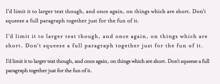
In the above example, the top one has no letter-spacing, whereas the second has letter-spacing: 1px and the bottom one letter-spacing: -1px. It’s not a giant change, but I think it’s obvious which is easiest to read.
If you pick a font that’s optimized for body text (your paragraphs), then you shouldn’t have to play with it’s letter-spacing. It’s possible you could do a little extra work and make it better, but my guess is the professional who designed the font did a pretty good job of that already.
DO: Always add letter-spacing to small uppercase text
You might feel like I’m cheating with this one because I’m just combining my previous two tips into one. Maybe I am, but it’s worth noting that you really should do this.
Small text is harder to read. Uppercase text is harder to read. Give people a chance, and space out those letters! I might also want to note here that maybe it’s not the best idea to use uppercase text for small text, but sometimes we do things for design purposes—it can look really nice when used in moderation—so if you just have to do it, then at least add that letter-spacing to it. Bonus: the extra spacing can give it a nicer aesthetic as well.
DON’T: Recude letter-spacing without a good reason
Tightening up the letter-spacing on something will make it harder to read. There are times that you can do it, for example Coudal Partners does it to nice effect on their headings (and notice the loose letter-spacing on their uppercase, small text right on top of the heading).
I’d limit it to larger text though, and once again, on things which are short. Don’t squeeze a full paragraph together just for the fun of it (see the example with the paragraphs above for proof).
Some fonts tend to work better when setting them with tight letter-spacing, and if you’d like a few tips on how to pick ones that work well, this article from Hoefler & Co. is great.
Recap
Here is the tl;dr for all of you who were skim reading till the end 🙂
Good things to do
- add
letter-spacingto all uppercase text - sometimes
letter-spacingcan be useful when thefont-sizegets small (less than 16px) - And
letter-spacingis really important if that small text is uppercase
Things you shouldn’t do
- Add too much
letter-spacing. - Add or reduce
letter-spacingto your body. It’s possible the font hasn’t been optimized, but chances are that it’s perfectly fine. - Reduce
letter-spacingwithout a good reason (and if you do, pick a font that it works well with)
{% include cta.html %}