5 awesome DevTool features to help you debug your CSS
When I started created websites for fun in the late 90s, we didn’t have many tools that would help us solve our CSS problems. There was probably some validator out there I didn’t know about (it was just a hobby for me at the time), but it was a lot of simply figuring out what was wrong with your file. Luckily for all of us, it’s so much easier now.
The big shift was in 2005 with the release of Firebug, which was an extension for Firefox which has since turned into the official Firefox devtools.
The reason Firebug was huge is it opened up a new way for us to be able to debug our CSS. Devtools have evolved a lot since then (as has CSS!), so in this post, we’ll be taking a look at 5 awesome devtool features, from ones that make your life so much better and easier to ones that are just really cool.
One important note: I’ll be looking at comparing both Chrome and Firefox DevTools throughout. Both do some things better than the other, and both have features the other doesn’t have at all.
How to access the DevTools
Before we get into the awesome features, it’s important you know how to open your DevTools to begin with.
The easiest way is to right click anywhere on the page, and choose either Inspect or Inspect Element in Chrome and Firefox respectively.
You can also use cmd + shift + C / ctrl + shift + C to open up your DevTools in both browsers. You can see what both look like below.
A note to Safari users: You won’t see this option come up. Safari does have DevTools, but you have to go into the preferences and enable it in the advanced tab. They’re also not as good as Chrome or Firefox’s. My opinion, even if you use Safari to browse the web, would be to use Firefox when developing your site.
Responsive Mode
So many people don’t know about responsive mode! I get a constant flow of YouTube commenters asking me how it works, or what extension they need to get.
Both Firefox and Chrome have it built into the browser, and they’re both super easy to use.
Firefox responsive mode ftw
Both Chrome and Firefox offer us some new features when in responsive mode, including being able to choose a specific device size and screen resolution to mimick. If you grab the bottom corner in either one, you can also resize to any size you want.
The one advantage that Firefox has over Chrome is, you can close out the DevTools in Firefox and keep responsive mode active, whereas in Chrome when you close your DevTools, you exit responsive mode automatically. It’s a small difference, but a nice little bonus to Firefox in my opinion.
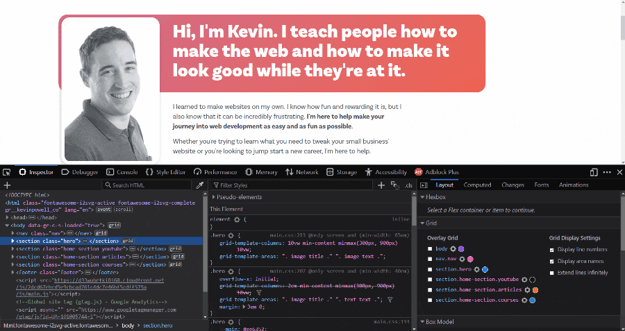
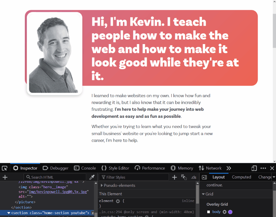
The Select Element button
Both Chrome and Firefox have a Select Element button, and it’s one of the most useful features, especially for beginners. Using it can help you see what different things on your page are doing, and why they are taking up the space they are, as it highlights the content, padding, border, and margin with different colors.
Chrome and Firefox use different colors schemes, but at the end of the day they are both doing the same thing.
Another nice thing with this is, when you click on one of the elements you're hovering over, it'll select it in the DOM and show you all the properties being applied to it in the styles tab.
Finding what’s causing all that empty space
Everyone runs into an issue where something is causing an overflow, or there is a big empty space somewhere in their document and they're unsure what’s causing it. Using the Select Element button to highlight the different elements of a page is the easiest way to figure out what the culprit might be.
Select Element button: Chrome bonus feature
When you use Chrome’s Select element button, there is a relatively new feature where it will not only show you a visual representation of the margins, borders, and padding, but also have a little tooltip with extra information in it.
Included in here are the color, font-family, font-size, margin, padding and more, right in front of your eyes, which is super handy.
Editing the box model
When you click on something using Select Element, it’ll highlight it, and you can see a visual representation of the box model.
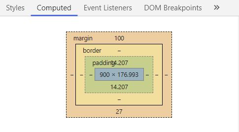
In Firefox you’ll find the box model in the Layout tab, whereas in Chrome you’ll find it under the computed tab.
If you hover over each part of the box model, it’ll highlight that on the page for you, which is really handy. But one thing I didn't know until recently is that you can actually edit the different parts of the box model directly on that visual representation!
If you double click on the numbers, you can edit them to your hearts content, meaning you don't have to go looking for margin or padding anywhere else, which is really handy to make quick changes to see what it might look like.
transition-timing-function visualizations
If ever you’ve done a transition you’ve probably used some sort of timing function, but we usually use something like ease, or ease-in-out because they are really easy to do. We can always create a custom cubic-bezier but yeah, those can be hard to figure out, right?
Both Chrome and Firefox have a little icon next to the timing function though, and if you click on it, you get some presets, but you can litterally go in and change and play with the curve to your heart’s content, and it will give you the cubic-bezier automatically.
With this, you can have full control on your transitions, plus it’s really fun to play with!
Firefox’s visualization is a little better
Both take a bit of a different approach in how their visualizer thing works, but Firefox is larger and a lot more clear and user-friendly.
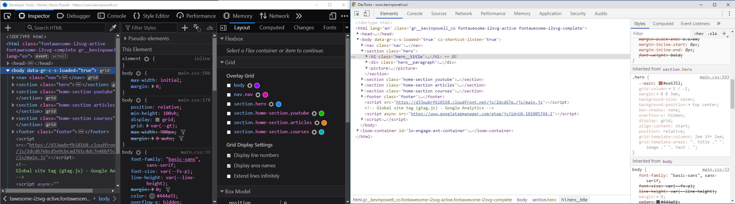
Flex and Grid visualizations
This is a Firefox only feature. In my opinion it’s a big enough game changer to easily make Firefox my go to choice as my development browser.
It’ll tell you when there are flex and grid containers or items on a page, and let’s you turn on a visualization to help you understand how both are working.
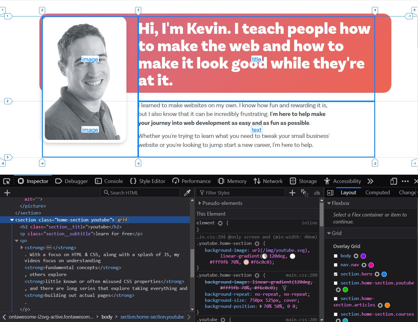
With grid, it allows you to also toggle line numbers on and off, as well as grid-area names, both of which make both learning and using Grid so much easier. You aren't stuck guessing at anything, you just click on the grid (or flex) item you want and you literally see exactly what the browser is doing.
If you haven’t yet tried them, the grid and flex visualizations are huge game changers.
There is a lot more
These are only a few of the features, there are a boatload more! The real trick is to make sure you re using your DevTools to begin with! If you are writing CSS at all, learning how to take advantage of your DevTools, whichever browser you’ve decided to use as your primary one, is the best way to debug CSS.