Creating a website - getting over the anxiety of starting with a blank file
One of my favorite classes to teach at my school is the introduction to HTML & CSS. It’s so much fun seeing people who’ve never even seen a line of code be able to make websites on their own after only a bit of time together.
As much fun as it is once they start to get the hang of it, I also see how daunting it is for them the first time I tell them to make a page from scratch without my help. It also lets me see all the mistakes they make when they start trying to make their very first pages all on their own.
When you are learning how to write HTML & CSS, it’s easy to follow along with an instructor or a tutorial and change the color of your nav link. It’s even easy to make a nice 3-column layout when someone is holding your hand through it.
It’s another to actually start creating a layout from scratch, even when you are given a design to follow.
You know HTML & CSS. You’ve followed tutorials online about the basics. HTML and CSS are such simple languages! Why is it so hard to figure out when looking at a layout?
CSS comes across as a simple language because it has such a simple syntax. Suddenly it’s a nightmare when you’re trying to make a layout though! Anyone reading thing knows all too well that CSS can be complicated and even counter-intuitive.
That leads to a lot of frustration.
When we’re new to coding, we’re given a task and we rush to start writing some code. My students do this all the time. It’s also why they make so many mistakes!
They know the HTML & CSS needed to make the layout, just like you do. By jumping right into the deep end though, it all goes to hell.
In this article, I will walk you through the steps I use to analyze a design and to then start coding it. I’m showing this to you because I know that it can help make coding more fun and enjoyable.
It’s also pretty simple. In the end, it all comes down to planning, and planning is an essential skill to have in this industry.
Steps to getting started
Have a design in front of you
If you have trouble with a blank file, please don’t start with a blank HTML file in front of you and nothing to go by.
Have a design of some sort. I don’t care if it’s a 10-second sketch where you planned out your layout, something you did using Paint, or an in-depth comp with breakpoints and everything planned out. Start with something.
I put demo’s together without any design in front of me, and I know people who like to design in the browser, so it’s not impossible to start without something. But if you have no idea then I can’t help you. You need some sort of plan to move forward.
Start planning things out
When I’m teaching in the classroom, I give my students a design and tell them to look at it and plan their attack.
I show them how to plan things out (which is what we’ll be doing in this article). I even give them a printout which outlines the steps for them. All they have to do is jot down the values they need.
They take my sheet, say thank you and then do the following:
- throw my sheet into some corner on their desk to never be seen again
- start writing HTML
- immediately style that one thing they wrote with CSS
- repeat over and over
- get frustrated when styles conflict
- fix the problem
- get frustrated when the next thing doesn’t do what they want it to
- ask me for help
- …
- End up sort of getting there but they’re unable to make changes because they can’t even find anything in their CSS file and mess of meaningless class names—I mean, what the heck is
.text-3and why is it inside.box-7?
You get the idea.
Writing code is fun, planning is boring. I get it, but I also know that planning things out does a lot of good things:
- Makes you able to write code faster
- Makes your code more organized
- Let’s you write much more maintainable code
- Makes writing code much less frustrating
And those all have the super awesome benefit of making writing your code a lot more fun! It’s amazing how much more pleasant of an experience it all is when things just work.
And the steps to get started are pretty simple.
The two main steps I’m taking are:
- Analyze the design (all of it… as in all the pages, screens, states, etc).
- Start giving names to things before you write any code
Analyze your design
It’s so important to do this first because when you don’t start by looking at the big picture, you start coding everything as an isolated element. I know there is the whole CSS-in-JS thing which tackles the “problem” of the global scope of CSS, but the global scope of CSS is awesome as long as you know how to use it (and I’m not here to argue about this, I get why CSS-in-JS is popular).
When I’m doing a first-pass on a design I’m looking for things that repeat themselves. More specifically I’m looking at/for:
- Typography
- The general layout
- Reusable components
- Colors
To help root what I’m talking about I’m going to use the design below of a 5-page site as an example of how I’d go about all of these steps.
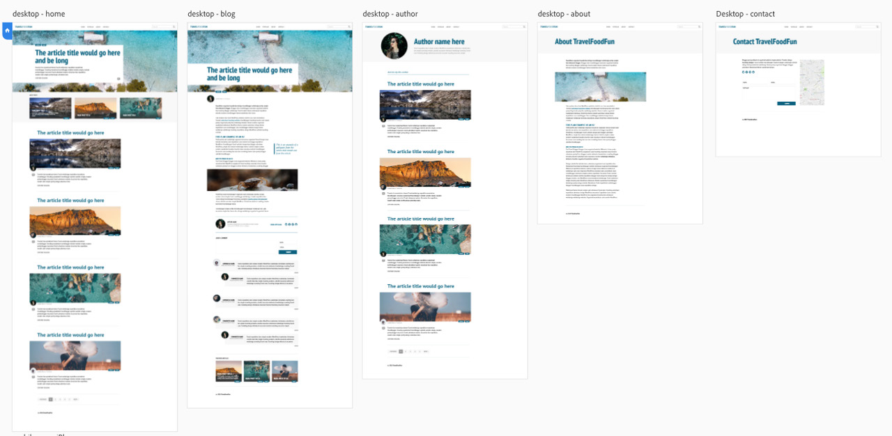
Sidenote: This design comes from my Sass course, where the final section of the course is all about using Sass to code up this design using all the tools learned throughout the course
Typography
Type is one of the easy places to start finding repeating elements. In general, every page should have a similar h1, h2, h3, etc. But maybe a .title and .subtitle class will prove to be useful as well. As long as the person who designed the site has a decent idea of what they are doing, this should be fairly simple to do.
Things to look out for while planning ahead
Be careful though, because it’s possible that things like colors change, even though everything else about that font is the same. For example, if we look at the design we’re analyzing in this case, all the headings are set in the same blue (#016180) except for the one in the “Latest Posts” section.

In this case, the “Latest Posts” heading is set with the same color as the body text, and the blog titles are white. Everything else about them though, the font, the font-size, being set in uppercase, is the same as all the others.
Because of that, I’m not thinking of creating a unique class to style the entire title, but maybe a simple modifier to change the color of them.
If I were coding this just starting at the top and working my way down without paying attention to the rest of the design, I’d probably end up doing something like this:
.subtitle {
  font-size: 1.125rem;
  color: #016180;
  text-transform: uppercase;
  letter-spacing: 1px;
  margin: 0.75em 0 0.25em;
}

.latest-post-card {
  /* a bunch of styles here */
}

/* forget about the title I already styled and then do this */
.latest-post-title {
  margin: 0.75em 0 0.25em;
  font-size: 1.125rem;
  text-transform: uppercase;
  letter-spacing: 1px;
  color: white;
}
If I’d take the time to look over my typography from the start and notice the similarities, I might take a BEM approach and do something like this instead:
.subtitle {
  font-size: 1.125rem;
  color: #016180;
  text-transform: uppercase;
  letter-spacing: 1px;
  margin: 0.75em 0 0.25em;
}

.subtitle--gray {
  color: #333;
}
.subtitle--white {
  color: white;
}
Here I’m creating a specific style, and then I’m using a modifier class to make specific changes to that class when needed. You could text this up a step though, using a general text class modifier instead of one specifically for the .subtitle as I did above.
.subtitle {
  font-size: 1.125rem;
  text-transform: uppercase;
  letter-spacing: 1px;
  margin: 0.75em 0 0.25em;
}

.text-primary {
  color: #016180;
}
.text-neutral {
  color: #333;
}
.text-white {
  color: white;
}
In this case, I’m not worried about setting text colors when styling my text, I am only interested in getting them to be the right size and look. I’m using a second class to control the color. I don’t do it this way myself, but it’s a nice DRY approach.
{% include cta-short.njk %}
The general layout
This is a big step people skip when they just jump right into the HTML and start writing their markup. You must look at the design as a whole before you do anything, especially if you don’t want to have to jump back and forth as you write your code.
Writing code is fun. At least I find that it is. But it stops being fun when things aren’t working. It’s not fun at all when you have to go back and make changes, and then changes, and then more changes. The frustration of having to go back and make changes is compounded when each change seems to break something else 😩 (we’ve all been there).
Looking at this design, we can see a basic grid structure that is repeating across all the pages.
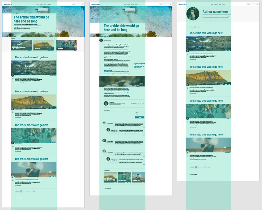
This could be set up as a .container, similar to how something like Bootstrap might work, but we have CSS Grid, so let’s use that — plus it’s not centered on the page, grid makes that easy!
I could set up the initial grid like this:
.main-grid {
  grid-template-columns: minmax(1em, 1fr) minmax(860px, 1080px) minmax(2em, 2fr);
}
Next, we can look at the actual content as well. The space inside the “container” if you will.
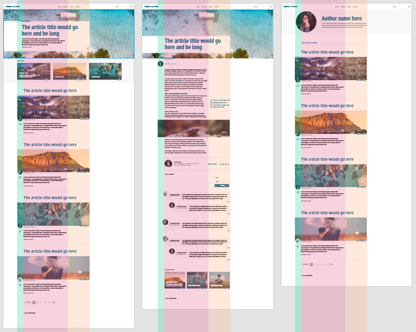
I’ve broken my grid up into three columns here. I’m not looking for equal spacing, I’m just looking for how content is organized.
So for the inner grid, something like this would work:
.content-grid {
  grid-template-columns: 5em minmax(550px, 775px) 225px;
}
Instead of ‘outer’ and ‘inner’ grids, I could have set it up with one single grid, but the more I looked at this design, the more this made sense for how I like to work.
Most of the content falls inside this, save for the nav, those big hero blocks at the top, and the latest articles on the homepage (I didn’t include two pages in the above screenshot, but the same follows over on those as well).
By putting this in two grids — the outer and inner — it allowed me to simplify things. If we had access to sub-grid I would have set it all up on one main grid. I’m really looking forward to sub-grid!
Because I went and analyzed the layout of this, I wasn’t writing a ton of code or dealing with some bloated 12-column grid system that I didn’t need.
We’re only looking at the desktop version of this (because it generally leads to a more interesting layout and therefore more to talk about for a post like this one), but if the grid can work here, some simple modifications would work for the smaller screen sizes as well (and by using CSS grid, we can use [grid-area](https://youtu.be/duH4DLq5yoo) and life is super awesome).
Reusable components
Once you’ve analyzed your layout and got an idea of how things can be organized in the big picture, you can start to look at the smaller picture a little bit as well.
It’s important that you start deciding what you’re going to call things before you start writing code.
Naming things in CSS can be a nightmare at times. Instead of trying to do it on the fly, it can make life a lot easier if you start naming things beforehand, even if it’s just in your head as you look over the design.
For a more complicated design — or even for simple ones when you’re just starting — it can be super useful to print out the design and write down notes and scribble over things to get a better plan in place.
Going back to the design from above, I’m going to specifically look at the ‘tag’ component and how I’d approach looking at that, both in the markup and the CSS.
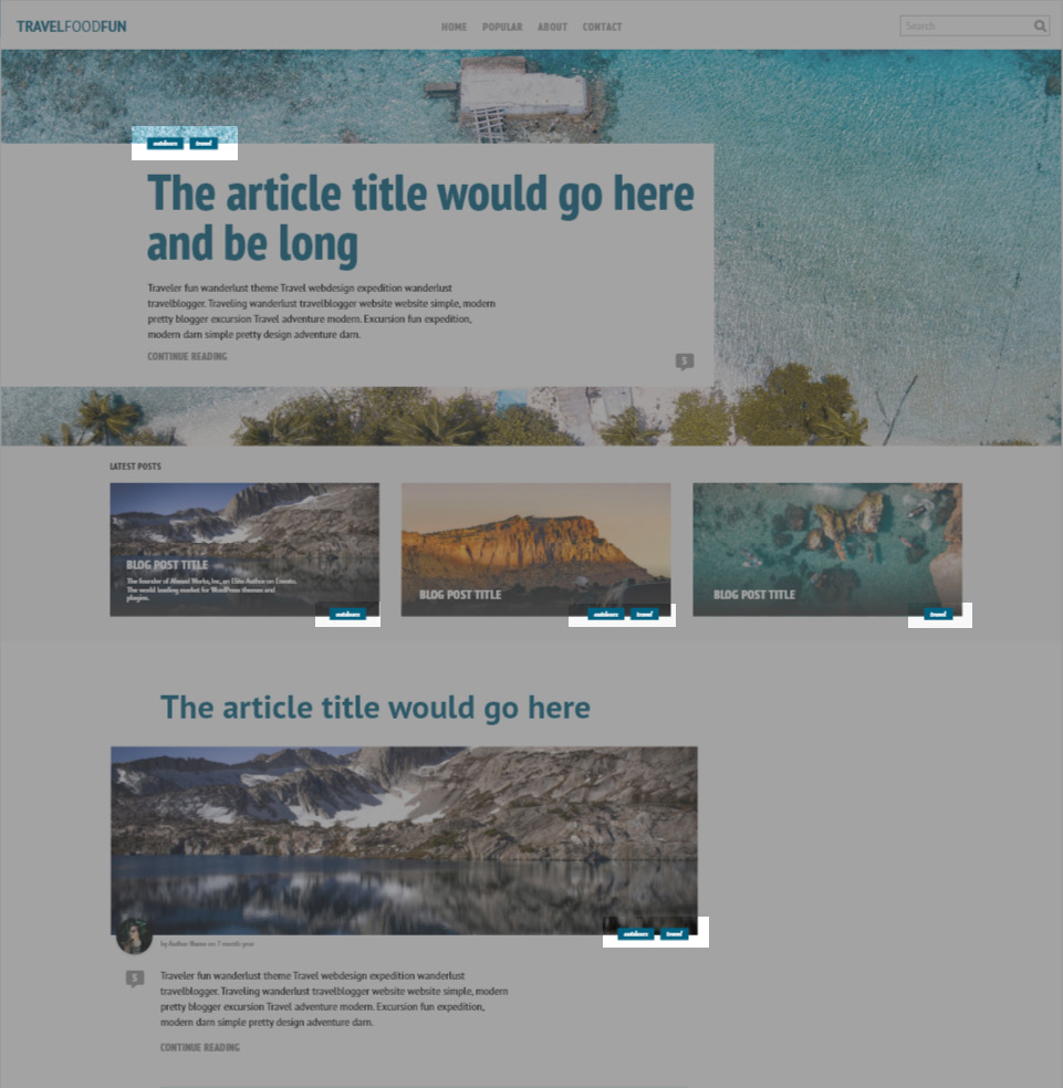
So for this, I’ve decided to take a pretty simple approach. The tags live inside of many different, larger components. In each one of these components, it lives somewhere a little different though.
Because of this, I’m just making a nice simple div which I’m going to use for general positioning purposes to start with.
<div class="tags">...</div>Because I know that things are going to move around depending on their situation, I also will have a modifier class for my .tags that will help position them in each of their individual contexts.
<div class="tags tags--hero">...</div>

<div class="tags tags--article">...</div>

<div class="tags tags--article-snippet">...</div>
Then, inside of this, I can place my individual tags. These tags are what are going to give them their actual appearance.
<div class="tags">
  <a class="tag">travel</a>
  <a class="tag">outdoors</a>
</div>
When it’s time to write my CSS, I have a clear purpose for everything. I know .tags is to set very basic settings. In this case, it’s only doing one thing:
.tags {
  position: absolute;
}
Like this, I’m DRYing out my code because I don’t have to repeat the position: absolute for all of the different tags, I just have to move them where I need.
And then I can use my modifier classes to put it where I need:
.tags--hero {
  top: 0;
  transform: translateY(calc(-50% - 2em);
}

.tags--article {
  bottom: -6em; /* padding from the article */
  transform: translateY(50%);
}

.tags--article-snippet {
  right: 2em;
  transform: translateY(-50%);
}
If I hadn’t planned this from the start, I’d have positioned the .tags in my hero first. It’d be one class, and it would work great.
Then I’d get to my .featured-content section and had a problem.
I’d use the same markup, but they would be in the wrong place. Now I’m stuck either creating a completely new class and repeating myself with some of the styles, or doing what we often do and have to back into my markup, add some new classes, then going back to my CSS and start making more changes there.
And then doing that all over again when I got to styling my .article-snippet.
By looking at the big picture first, I was able to identify that I have these tags and that they always look the same. Very awesome.
But then I also noticed that they were used inside a bunch of different components. That’s interesting.
And then I see that, in each of those different components, they are in a different position. Sometimes the top left, sometimes the bottom right… hmmm.
With that knowledge, I can go into writing my CSS for those tags with a plan of attack in mind!
It’s not a magic formula
The first time you try to plan something out, you’ll be certain that you nailed it. Then you’re still going to go back to your markup to add a class or change how you style something much later on when you realize you could have done it better.
The time after that, you’ll be able to build on past experience and avoid some of those mistakes.
The more you plan things out, the better you get at it.
Planning is an essential skill, and not just for CSS
In essence, it all comes down to planning. Having a plan before you write a single line of code will mean that you are going to have an easier time, and it’ll probably mean that you are able to write better code as well.
If you are reading this (and made it this far into the article) I’m assuming you are relatively new to the world of front-end web development. Eventually, you’ll probably want to learn JavaScript.
JavaScript frightens a lot of people. Most places teach you the theory of how it works. But just like staring at a design and having a blank HTML & CSS files in front of you can be daunting, when it comes time to actually build something you simply have no idea where to start.
In JS it’s all about explicitly laying out the steps that you’ll need to take. Don’t start by writing a line of code, write all the individual little things you’ll need to do to make your thing work. That can make a daunting task much simpler, and frame it in a way that you can figure out what to do.
Your life easier because you now can work on little elements one at a time instead of being overwhelmed by the big picture.
It’s the same deal with planning out a page, and with many other aspects of development. It’s always about analyzing the problem (the layout, the behavior, etc), and then planning out how you’ll approach solving that problem.
So next time you open up a new file, start planning out how you are going to create the layout you have in front of you.
Instead of being overwhelmed, or having no idea where to start, you’ll have a plan of attack. It might not be the right plan the very first time, but you’ll be able to get started and get something working. And the more you do it, the better your plan will be.
Soon you’ll be looking at a layout and instantly breaking the entire thing down in your head and have a plan of attack. It’ll become an instinct, even on layouts that you don’t need to build!
{% include cta.html %}